Feather Client logo searches come from creators making thumbnails, players customising desktops and people checking whether a download looks genuine. The mark is simple, which makes it easy to recognise and also easy to imitate. Understanding its shape and colors helps you use it well and spot imitations quickly.
The Shape of the Logo
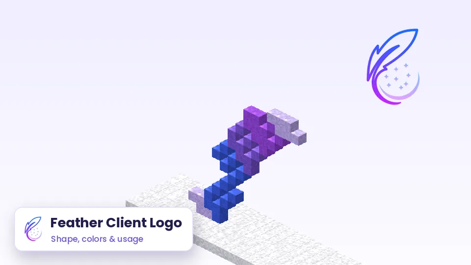
The logo shows a single stylised feather sweeping upward from a curved base. Its outline is drawn with smooth, flowing strokes rather than hard angles, which gives the mark a light, fast feel that suits a performance-minded Minecraft client.
The version shown on this site also places small sparkle shapes inside the curve near the base. Those details add depth without cluttering the silhouette, so the mark still reads clearly at small sizes such as a taskbar icon.
The Color Palette
The feather uses a gradient that moves from a bright blue at the tip through violet to a soft lilac near the base. The gradient is what most people remember, and it is why this website uses the same family of blues and purples throughout its design.
| Role | Approximate color | Where it appears |
|---|---|---|
| Primary blue | #4C5CF5 | Feather tip and upper strokes |
| Violet | #8B3FF0 | Middle of the feather |
| Lilac | #C9B9FF | Lower curve and sparkles |
These values are approximations sampled for this site's design, not an official brand specification. If you need exact colors for commercial work, ask the current brand owner directly.
Why a Feather?
A feather suggests lightness and speed, two qualities players want from a client that promises smoother performance. It also links neatly to the name, making the brand easy to remember after a single glance at a launcher icon or video thumbnail.
The Logo After the Dawn Rebrand
In May 2026 InPVP announced it had acquired Feather Client and was rebranding it as Dawn. New launcher builds and pages may therefore show Dawn branding instead of, or alongside, the feather mark.
Many players, videos and guides still use the feather logo because it remains widely recognised. When you see both brands, check the current official pages to understand which one a particular download or announcement refers to.
Spotting Fake Branding
Scam downloads often borrow a familiar logo to look trustworthy. A logo on a page or file icon proves nothing on its own, so combine visual checks with common sense about where the file came from.
- Stretched, blurry or oddly colored logos on download buttons.
- Pages promising cracked, premium-unlocked or “v3 hacked” builds.
- Files whose icon is a logo but whose extension is unexpected.
- Requests to disable antivirus before running a launcher.
Checking a File Icon
Icons can be copied into any program, so a correct-looking feather icon on a file does not prove it is genuine. Turn on file extensions in your file manager and scan the file before opening it.
Using the Logo Respectfully
Creators commonly show client logos in tutorials, reviews and thumbnails to tell viewers what a video covers. That kind of descriptive use is widespread, but you should still avoid suggesting an official partnership or endorsement that does not exist.
| Generally fine | Better to avoid |
|---|---|
| Showing the logo in a tutorial about the client | Placing it on merchandise you sell |
| Using it as a small label in a comparison | Changing it to look like your own brand |
| Keeping original proportions and colors | Stretching, recoloring or cropping it oddly |
| Crediting the client by name | Implying the client sponsors your content |
This is general guidance, not legal advice. For anything commercial, contact the brand owner and follow their written terms.
Practical Design Tips
Give the logo breathing room so it does not touch text or the edge of an image. On light backgrounds the gradient stands out well; on busy backgrounds, place it on a plain white or very light panel so the feather stays readable.
- Use PNG or SVG versions with transparent backgrounds.
- Scale proportionally and never squash the feather.
- Pair it with clean sans-serif text, such as Poppins.
- Test the icon at small sizes before publishing.
Logo Sizes and File Formats
Different places need different sizes. A favicon may be only 32 pixels wide, while a video thumbnail needs a much larger, crisp version. Start from the highest-quality source you have and scale down rather than enlarging a small image.
| Use | Suggested format | Tip |
|---|---|---|
| Website icon | PNG at 32 and 180 pixels | Use a plain background for small sizes |
| Video thumbnail | PNG with transparency | Place it on a light panel for contrast |
| Print or large display | SVG or very large PNG | Avoid upscaling small files |
Building a Matching Color Scheme
Pairing your own design with the logo's palette makes thumbnails and banners feel consistent. Use the blue for headings or buttons, the violet for highlights and the lilac for soft backgrounds, keeping plenty of white space between them.
Common Mistakes When Using the Logo
- Placing the gradient feather on a dark, busy screenshot where it disappears.
- Adding heavy outlines or glows that change the original look.
- Combining it with other brand logos in ways that imply a partnership.
- Using a low-resolution copy saved from a search result.
Feather Client Logo FAQs
What colors are in the Feather Client logo?
The feather blends a bright blue, a violet and a soft lilac in a smooth gradient from tip to base.
Can I use the logo in my YouTube thumbnail?
Descriptive use in tutorials is common. Keep the logo unaltered and avoid implying sponsorship or official status.
Does a feather icon prove a download is real?
No. Icons are easy to copy. Check the source, file extension and a security scan instead.
Is the logo still used after the Dawn rebrand?
Many players and guides still use it, while newer official material may show Dawn branding. Check current official pages for the latest identity.
Conclusion
Feather Client logo design relies on one clean feather and a memorable blue-to-purple gradient. Use it in its original proportions and colors, avoid implying endorsement and never treat a familiar icon as proof that a download is safe. With the 2026 move to Dawn, check current official pages whenever branding questions matter for your project.